The Mid-Century Show House: The Christopher Kennedy Compound
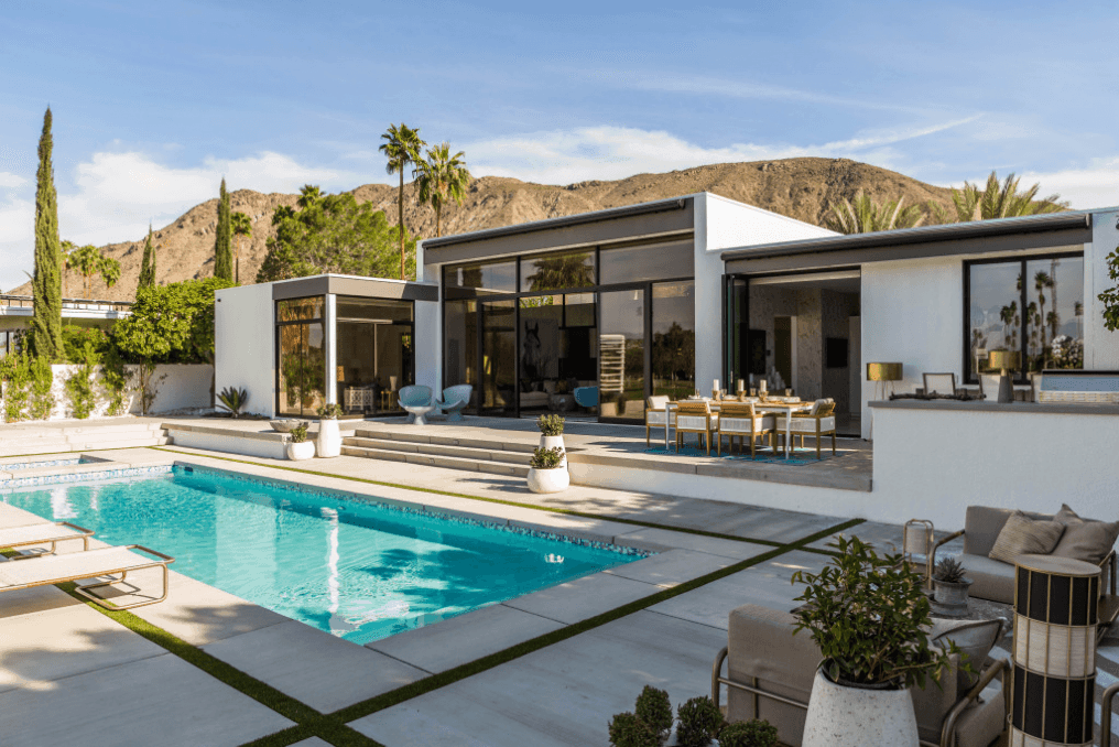
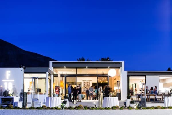
The Christopher Kennedy Compound was billed as “the” event/venue of Modernism Week. The show house is set up as a non-profit with proceeds benefitting education and preservation of architecture throughout Palm Springs. Its’ estimated that 4,000 people toured this year’s show house. Excellent!
Christopher Kennedy, a local Palm Springs decorator, is not only the namesake of the compound, but he’s also responsible for spearheading this project for the third year in a row and assembling the team of decorators. Just imagine trying to put together a team of creatives who can, one, decorate in the mid-century style, and two, work alongside a group of other decorators…I can only imagine the number of times eyes rolled and remarks must have been uttered under ones breathe. Lol! But come opening day, the compound shined bright at a sold out red carpet event.
You be the judge!
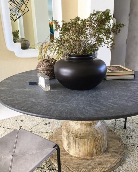
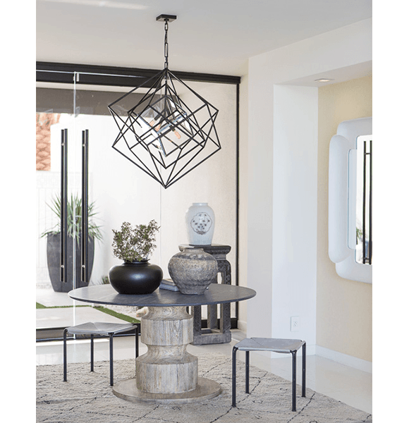
Entry Hall– By the Canadian firm, 31 Westgate, was centered by a striking chandelier by Kelly Wearstler, and Laura Kirar’s sculptural Kiwari Dining Table for McGuire.
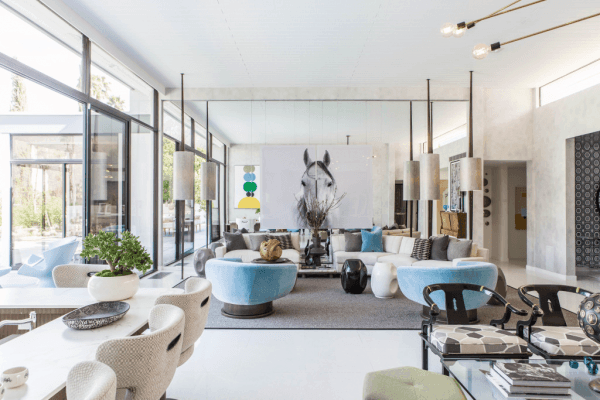
Living Room– They say every room needs a focal point and designer Michael Berman gave us one with a monumental sepia toned photograph of a stallion! Not sure what I might have used. What would you have used to focus this room?
Berman did a masterful job using a huge mirrored wall to add depth and then dividing the space with lighting by outlining the main sitting area with a trio of tension-pole lamps with shades which ran from floor to ceiling, and further defined the areas with a floating aerial chandelier over the Chinese furnished conversation area.
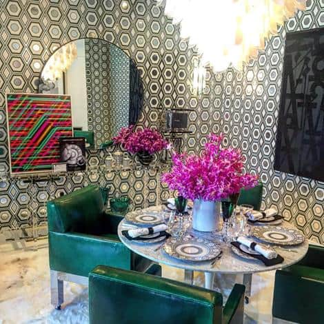
Dining Room – Martyn Lawrence Bullard went full tilt with metallic walls and ceiling, an oversized round mirror for dimension, vintage chairs on casters clad in More & Giles leather and a vintage Venini chandelier.
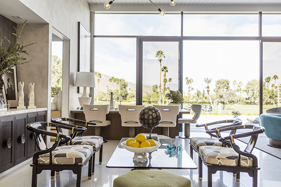
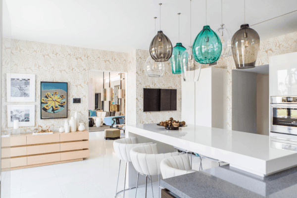
Kitchen – The heart of the home was done by the man who is at the heart of the project, Christopher Kennedy. Kennedy warmed up what was probably a cold box with warm whites, rich greys and crèmes which he popped with multiple ocean colored blown glass pendants by Tech Lighting.
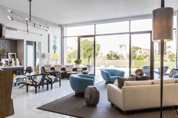
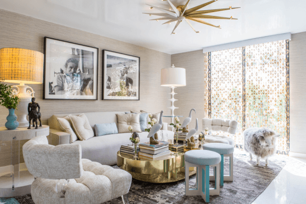
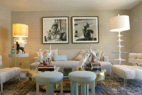
Family Room- By LA designer Patrick Dragonette. This was one of my two favorite rooms. Dragonette used soft hues of white and beige, brass, Lucite, and ceramics (many pieces from his own gallery in LA) to create a serene and elegant place to relax. Undoubtedly this designer knows the difference in whimsy and kitsch.… effectively using a flock of elegant white ceramic shorebirds holding court over a terrain of art books. He goes further with a nod to Hollywood royalty with a pair of oversized black and white photos of James Dean and Elizabeth Taylor, outtakes from the 1956 film, Giant.
Why, these nods to Hollywood you ask? The story goes that in the early days of Hollywood, stars were contractually obligated to be available on short notice and had to stay within a certain number of miles of the studios. Palm Springs was a geographic fit and the fun began! It still attracts stars including Leonardo DiCaprio who purchased the late Dinah Shore’s Donald Wexler designed-house, which is available for short term rentals and events, starting at $4500 per night.
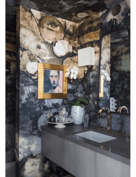
Powder Room– by Michel Boyd, who used metallic wallpaper for maximum effect giving a sense of place for this small space. Rose gold finished faucet on the floating wall cabinet, Barry Dixon designed mirror, and aged iron wall sconce.
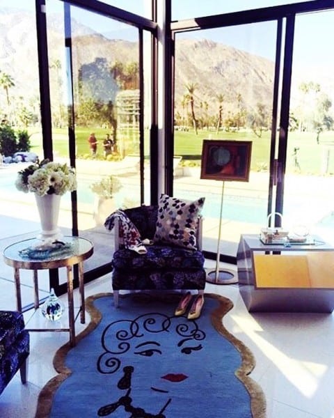
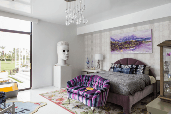
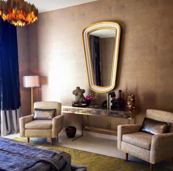
Master Bedroom– Designed by the always fun and whimsical Julia Buckingham. One of my favorite things was the wonderful Buckingham designed mosaic tile top table on brass frame in the corner sitting area.
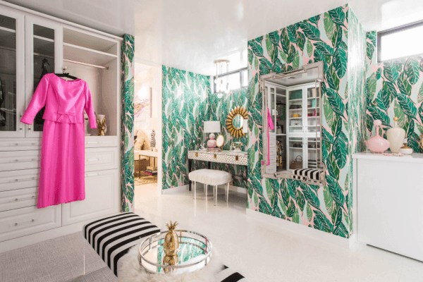
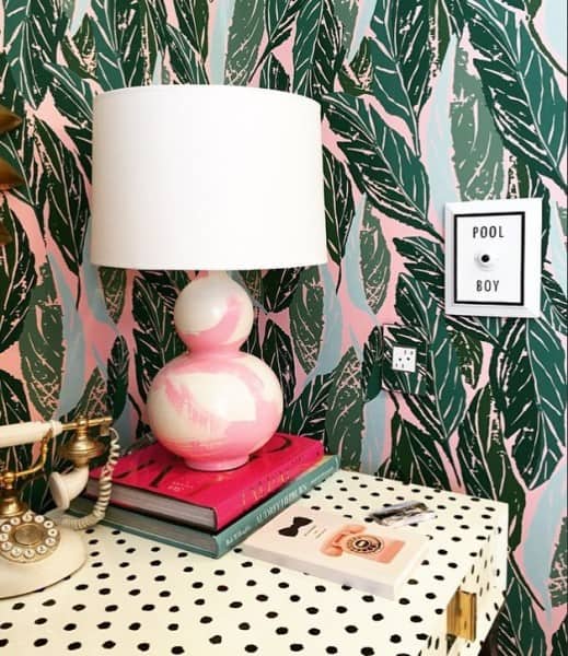
Master Dressing Room (The “Glam Cave”)- The whimsy continued in the adjacent Master walk-in-closet, designed by Blogger Kelly Lee (aka Kelly Golightly). Wallpaper reminiscent of the Beverly Hills Hotel designed by Justina Balkeney and the cheeky “Pool Boy” call button! The room was centered by a glam-sized shaped mirror framed with antiqued mirror, and an airy pair of benches floating on acrylic legs.
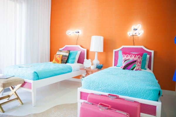
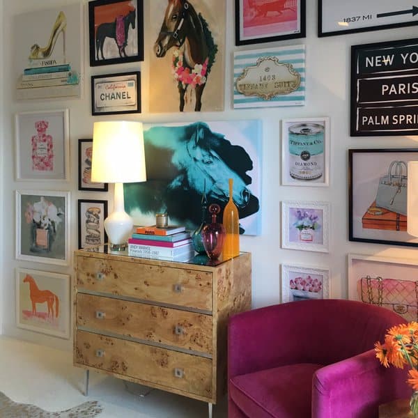
Teen’s Bedroom- By TV personality Carson Kressley, who used a pair of lacquered twin beds and neon artwork, and more Joe Cariati blown glass vessels! I loved the wall-to-wall of Warhol-esque framed fashion and logo prints for the label conscious teen!
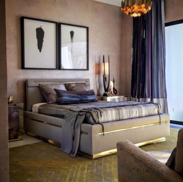
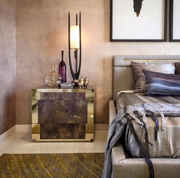
Guest Room– My other favorite room, by New Yorker Justin Shaulis. This room is warm, rich, and layered beautifully. Joe Cariati blown glass vases were juxtaposed with a pair of sculptural, mid-century Modeline table lamps.
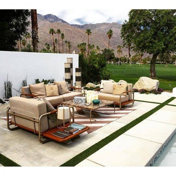
Poolside- Jamie Durie, who debuted his Hugo Outdoor furniture collection which was fabulous upholstered in a quilted Sunbrella sling fabric, with its satin brass finish tubular metal frame and teak insets.
One of my concerns for mid-century interior design (and designers) is when kitsch gets inserted as a stand-in for the great designs from the mid-century and the sense of space and time can be lost. I think this group of designers did a wonderful job recreating the essence of a 1950’s residence while incorporating recent design and mid-century sensibilities. Let’s work to understand this great period and honor with purity.

